


Orpheum Theater
UX Design | 0 to 1 | Mobile App
Securing tickets to Madison's most visited venue just got easier
Securing tickets to Madison's most visited venue just got easier
My Role
UX Designer -
Design: Wireframe, Prototype
Research: Observation, Interview
Team Member
Jia Fu Liu Designer
Project Timeline
February - May 2024 (3 months)
Background
Located in downtown Madison, Wisconsin, Orpheum Theater is a beloved venue that brings unforgettable live entertainment to students and locals. Currently, it only has a website, and tickets are available exclusively through third-party platforms.
Problem
Problem
The current website no longer aligns with market demands or audience expectations.
The current website no longer aligns with market demands or audience expectations.
The current platform forces users to complete ticket purchases externally, making it unnecessarily difficult to buy, track, and manage their tickets.
The current platform forces users to complete ticket purchases externally, making it unnecessarily difficult to buy, track, and manage their tickets.
EXPLORE
EXPLORE
Why Mobile APP will work better than website
Why Mobile APP will work better than website
By integrating ticketing and event information into a single mobile app, Orpheum Theater can keep all profits and use audience data to personalize recommendations, making it easier for users to discover new shows and stay engaged.
By integrating ticketing and event information into a single mobile app, Orpheum Theater can keep all profits and use audience data to personalize recommendations, making it easier for users to discover new shows and stay engaged.
Goal
Goal
Goal
To create a centralized platform that integrates ticketing and event insights in one place.
To create a centralized platform that integrates ticketing and event insights in one place.
User Base
User Base
User Base
University students
University students
Local resident or visitors
Local resident or visitors
Die hard fans
Die hard fans
Prediction
Prediction
Prediction
Combining ticketing and events into one platform is expected to reduce ticket purchase time and increase time spent on the app.
Combining ticketing and events into one platform is expected to reduce ticket purchase time and increase time spent on the app.
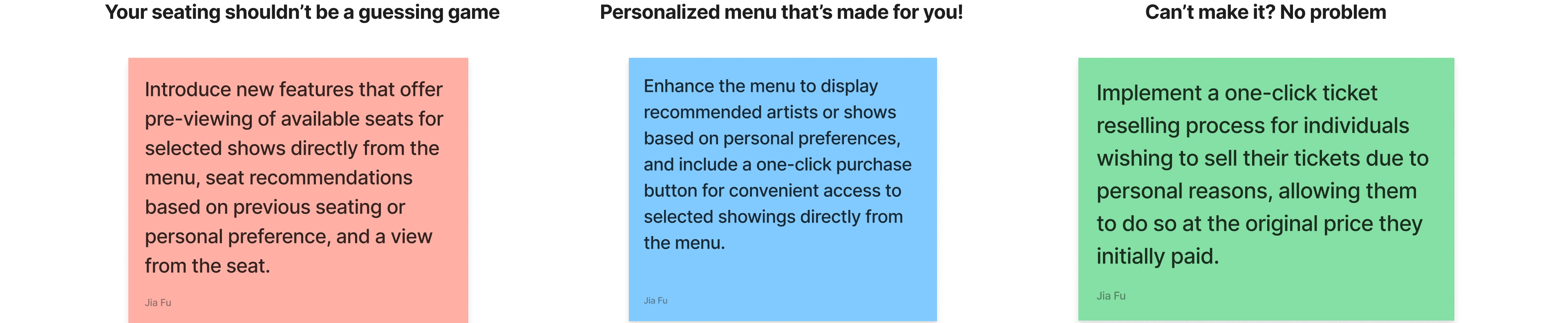
Solutions
Solutions
Reduce cognitive overload
Reduce cognitive overload
Minimize cognitive overload by displaying only the most relevant information, preventing users from feeling overwhelmed by excessive content.
Minimize cognitive overload by displaying only the most relevant information, preventing users from feeling overwhelmed by excessive content.
Minimize cognitive overload by applying effective information architecture principles in the app's design.
Personalization for users
User Personalization
Adding personalized features to the ticketing app will create a more welcoming experience, helping users navigate more intuitively and complete their actions with ease.
Adding personalized features to the ticketing app will create a more welcoming experience, helping users navigate more intuitively and complete their actions with ease.
A personalized app will make users feel appreciated while making it easier for them to find what they want.
Human-Centric Features
Human-Centric Features
Human-centric features make the purchase process more intuitive and user-friendly, ensuring a smoother experience for users.
Human-centric features make the purchase process more intuitive and user-friendly, ensuring a smoother experience for users.
Human-centric features that are researched and tested to help make the purchase process more straightforward.
Planning
Planning
How do we build a complicated project from scratch with a tight deadline?
Brainstorm,StoryboardPersona, Task Flows
Brainstorm
Duration: 1 week
Ideation
Goal establishment
Storyboard
Duration: 1 week
Empathy
User journey
Task flow
Duration: 1 week
Empathy
Journey mapping
Brainstorm
Brainstorm
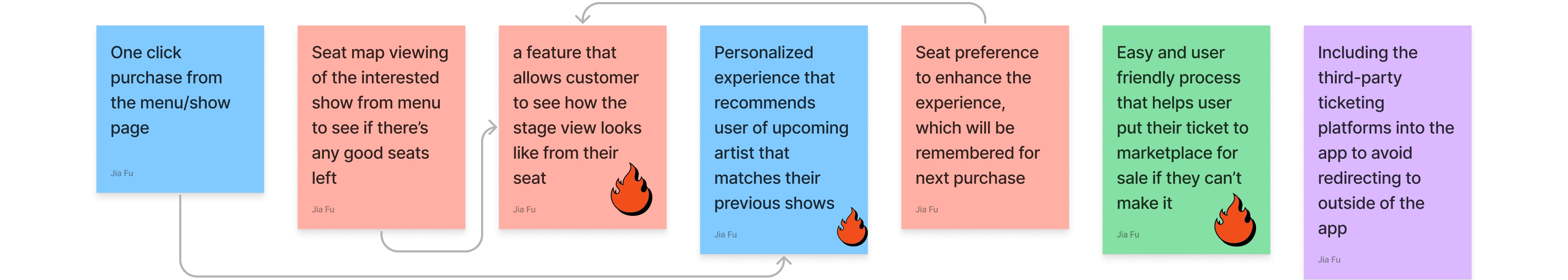
Img 1. Stickers from the brainstorming session via FigJam
Img 1. Stickers from the brainstorming session via FigJam
Img 1. Stickers from the brainstorming session via FigJam
Process
Process
The first step of this project was to brainstorm key features that would directly address the identified problem.
I focused on ideas that improve how users find what they want to watch, understand their seating location, and manage their tickets after purchase.
The first step of this project was to brainstorm key features that would directly address the identified problem.
I focused on ideas that improve how users find what they want to watch, understand their seating location, and manage their tickets after purchase.
Result
Result
I began with 40 ideas, narrowing them down to 20, then 7, and finally 3. With each round of elimination, I introduced constraints to ensure the remaining ideas were both effective and feasible. For example, while a seating preference feature seemed useful, guaranteeing the same seat for every event was impractical, making it unviable.
I began with 40 ideas, narrowing them down to 20, then 7, and finally 3. With each round of elimination, I introduced constraints to ensure the remaining ideas were both effective and feasible. For example, while a seating preference feature seemed useful, guaranteeing the same seat for every event was impractical, making it unviable.
Storyboard & Task Flow
Storyboard & Task Flow
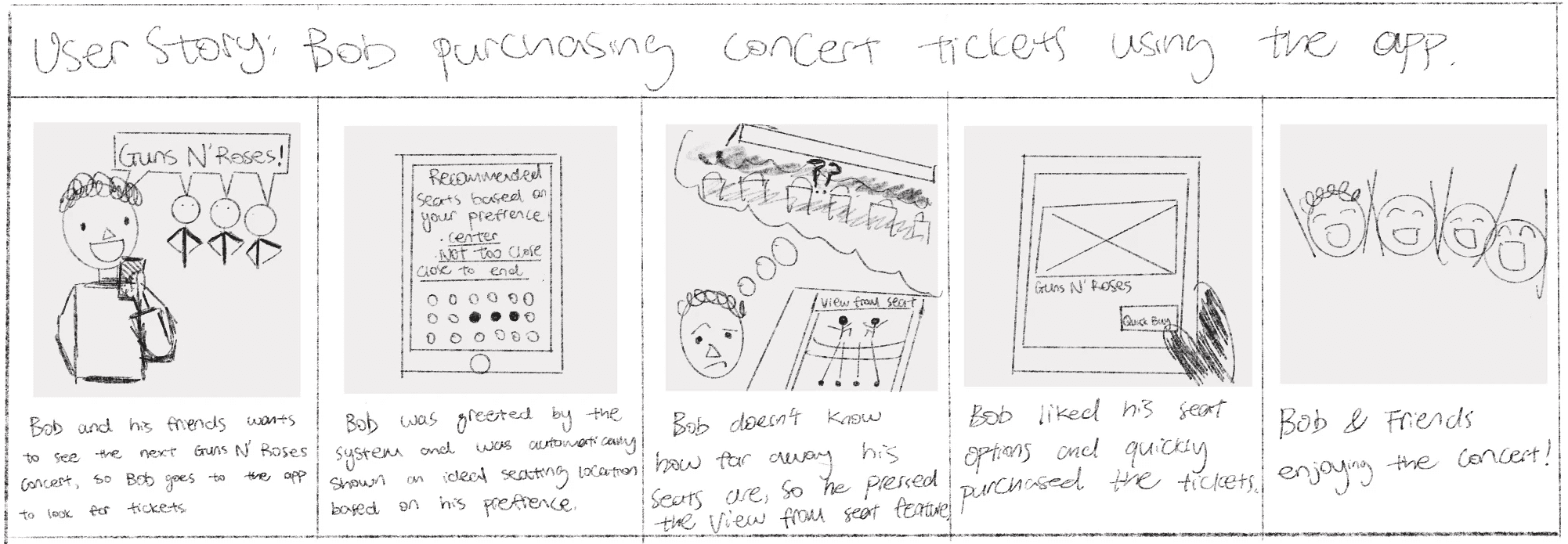
Img 2. User storyboard scenario created via ProCreate on iPad
Img 2. User storyboard scenario created via ProCreate on iPad
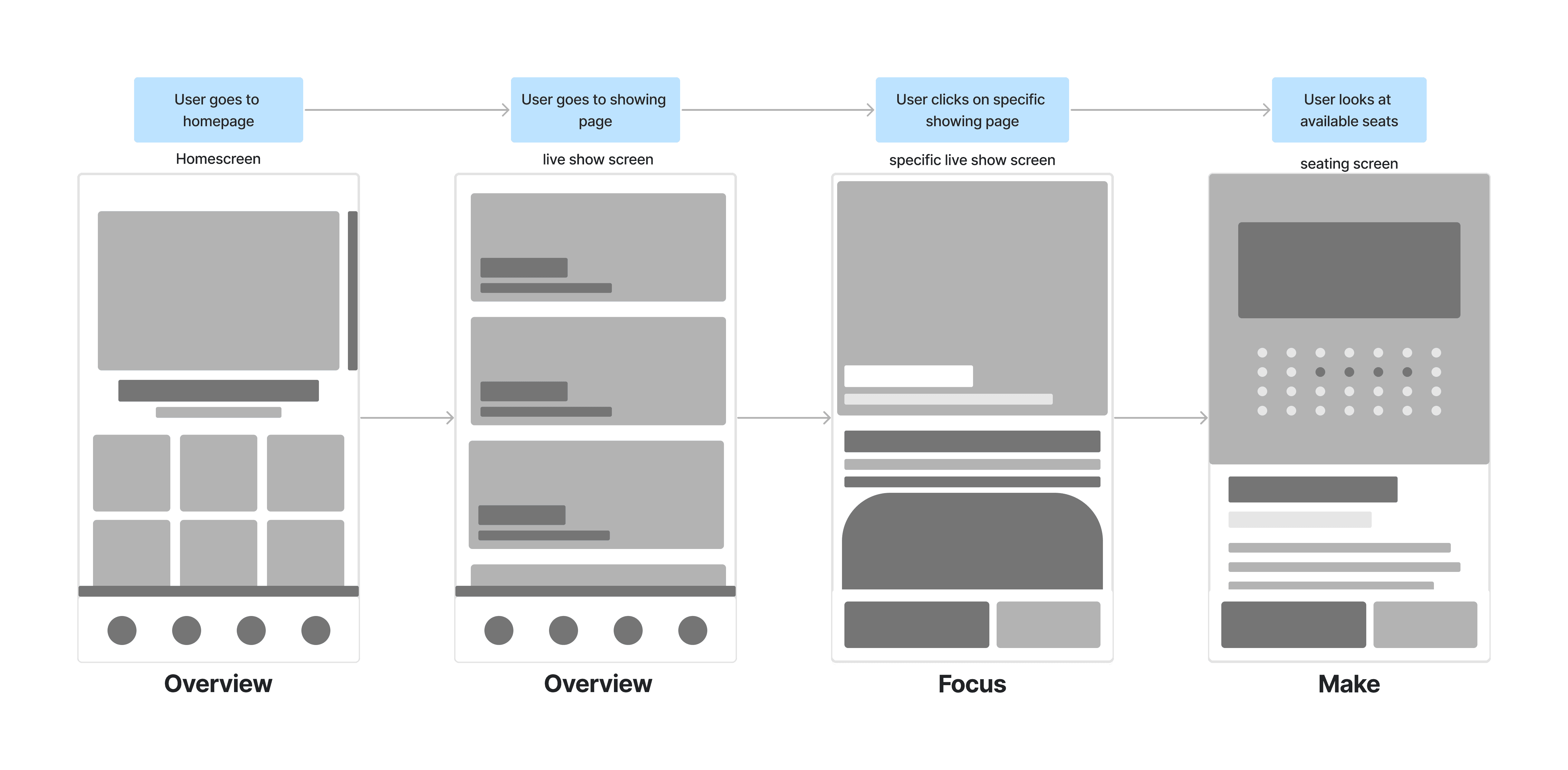
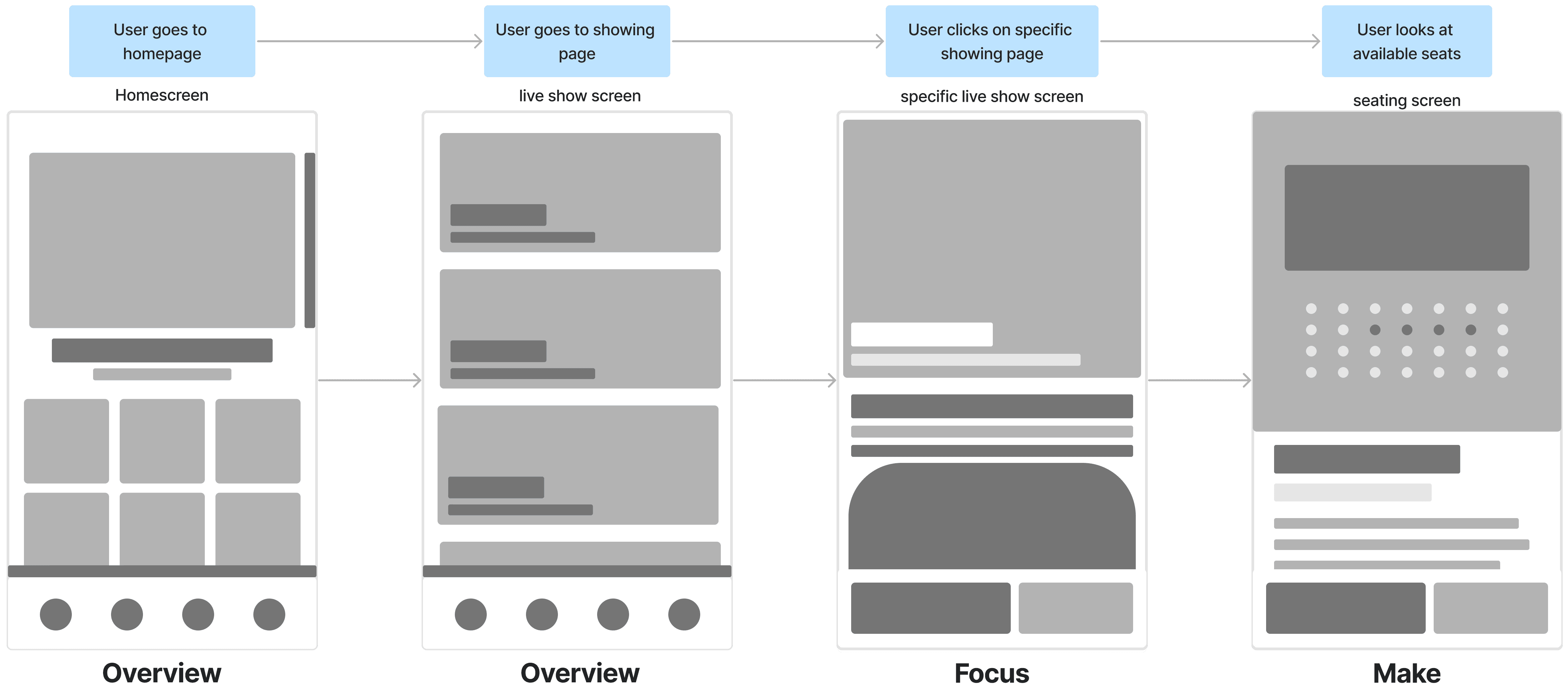
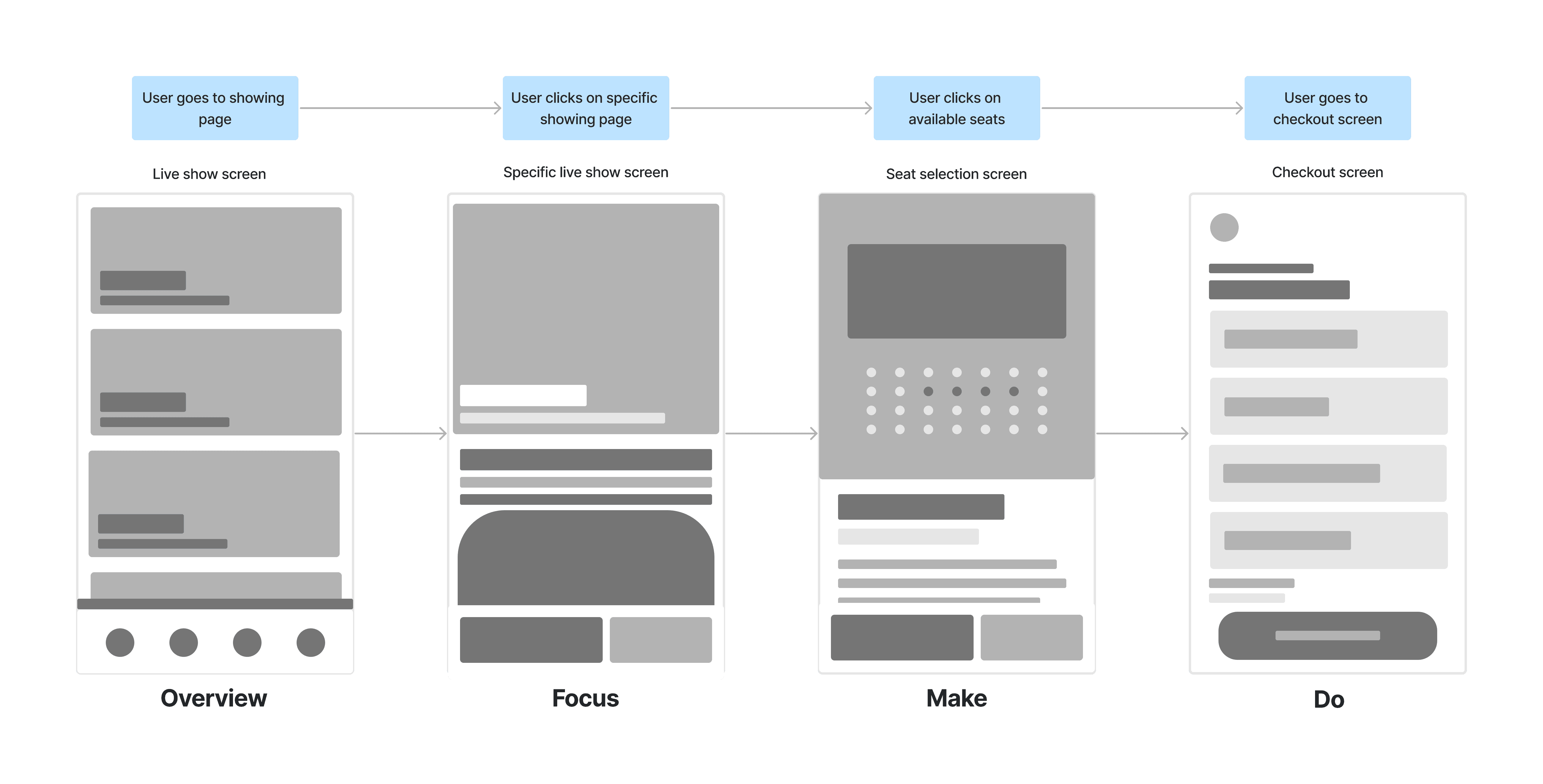
Img 3. General User task flow chart via FigJam
Img 3. General User task flow chart via FigJam
Img 3. General User task flow chart via FigJam
Process
Process
To better understand how users might interact with these features in real-life scenarios, I sketched examples of where and how users might engage with the new features I brainstormed. These initial sketches will later be refined into detailed design flows, focusing on the specific steps users take to complete these actions.
To better understand how users might interact with these features in real-life scenarios, I sketched examples of where and how users might engage with the new features I brainstormed. These initial sketches will later be refined into detailed design flows, focusing on the specific steps users take to complete these actions.
Result
Result
Storyboarding helped refine the task flow by identifying key features and components that enhance the user experience and support users in achieving their goals. It also served as a valuable bridge, establishing the foundation for task flows that will guide the development of pages and components needed.
Storyboarding helped refine the task flow by identifying key features and components that enhance the user experience and support users in achieving their goals. It also served as a valuable bridge, establishing the foundation for task flows that will guide the development of pages and components needed.
Research
03 | Research phase
Justifying the User Flow, Task Flow, and Design System by conducting User Research
User Testing
User Testing
Duration: 1 week
Empathy
Flow logistics
Design System
Design System
Duration: 1 week
System
Design consistency
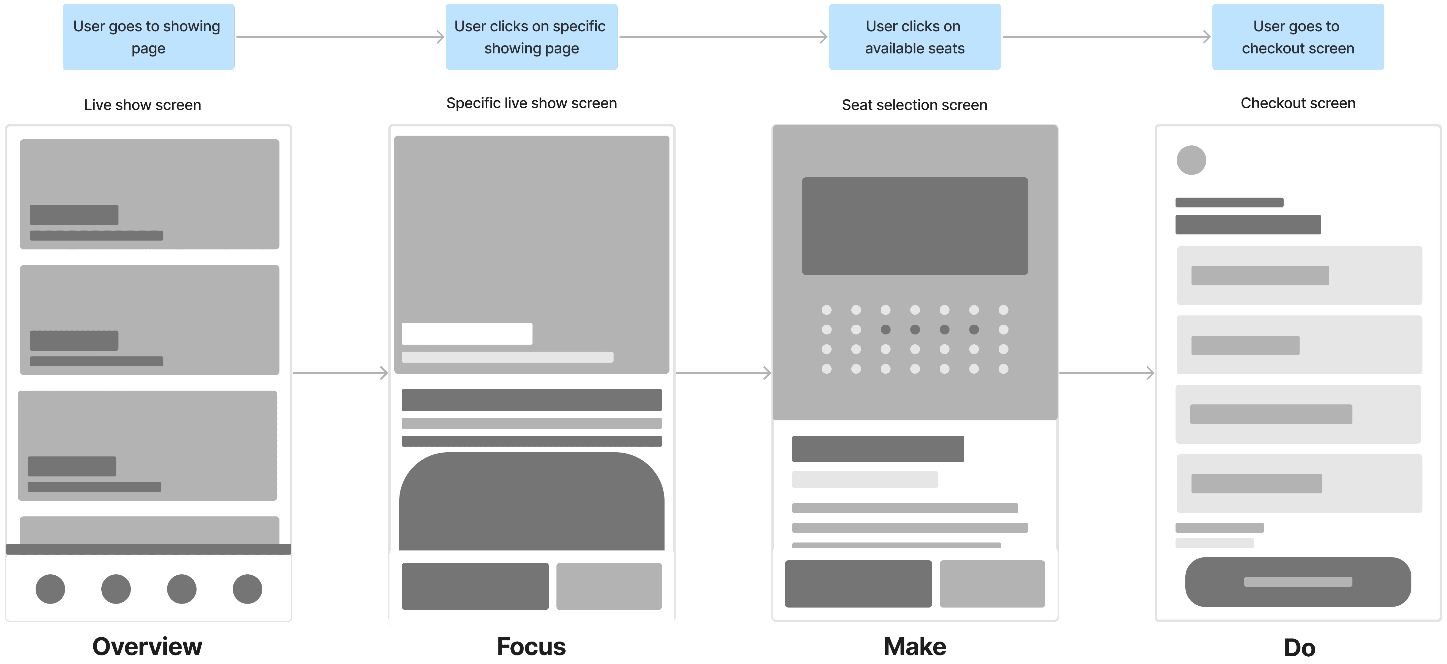
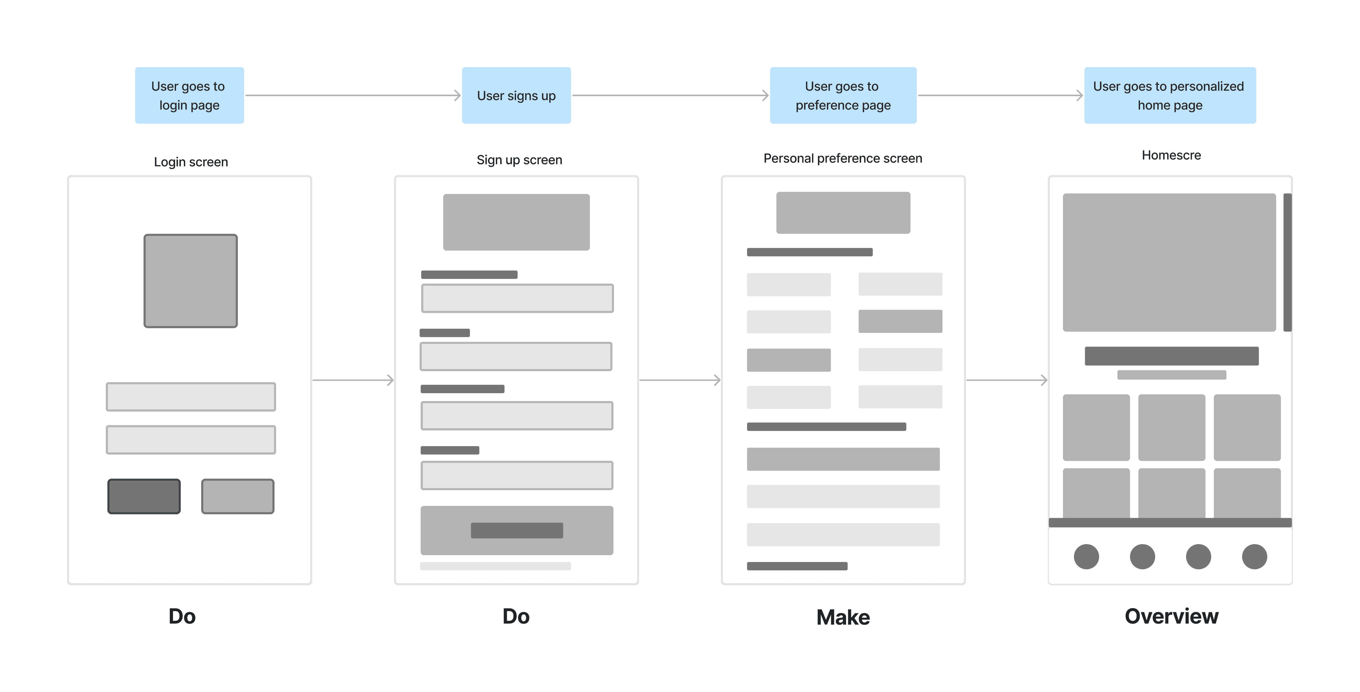
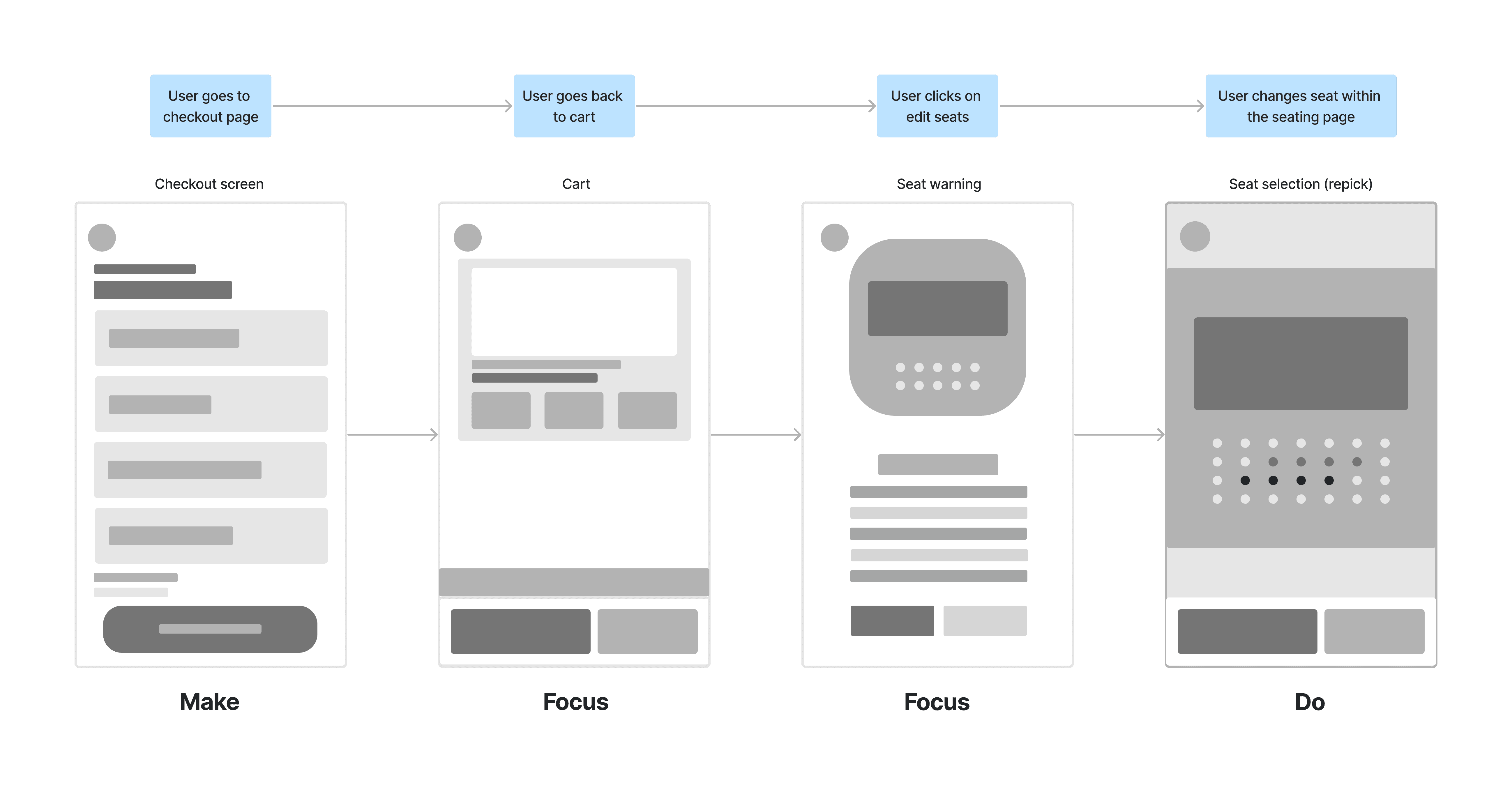
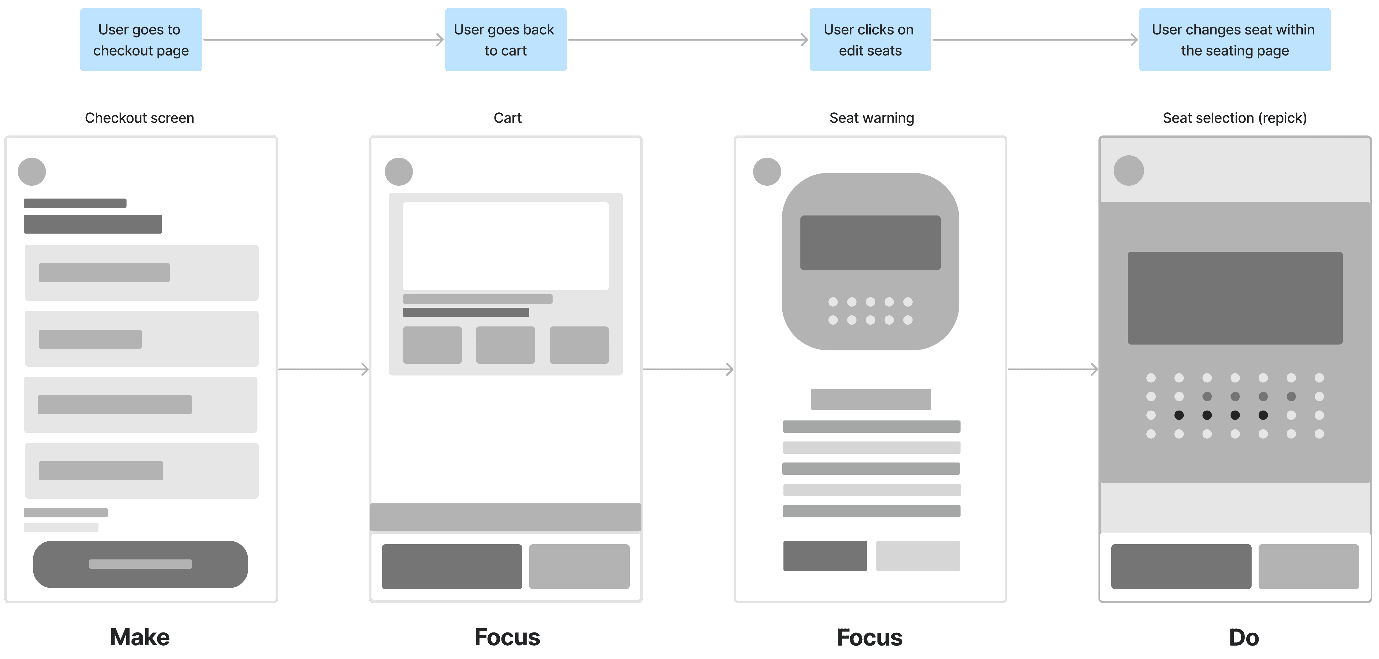
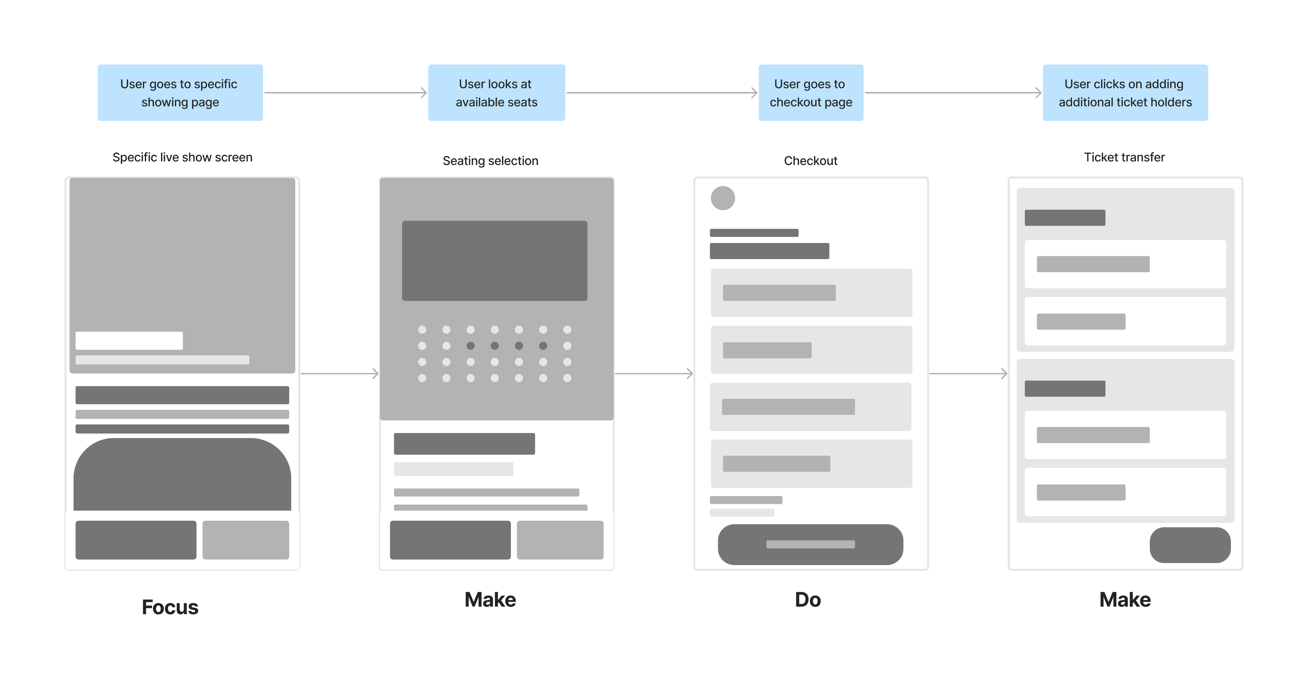
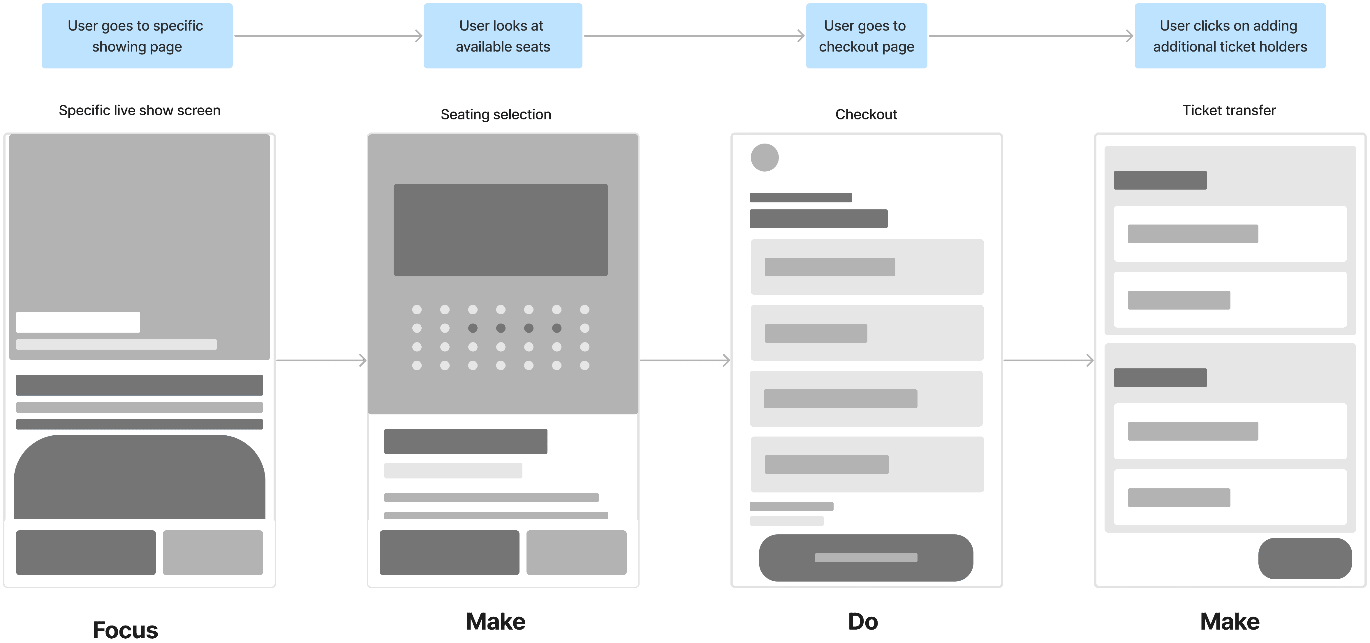
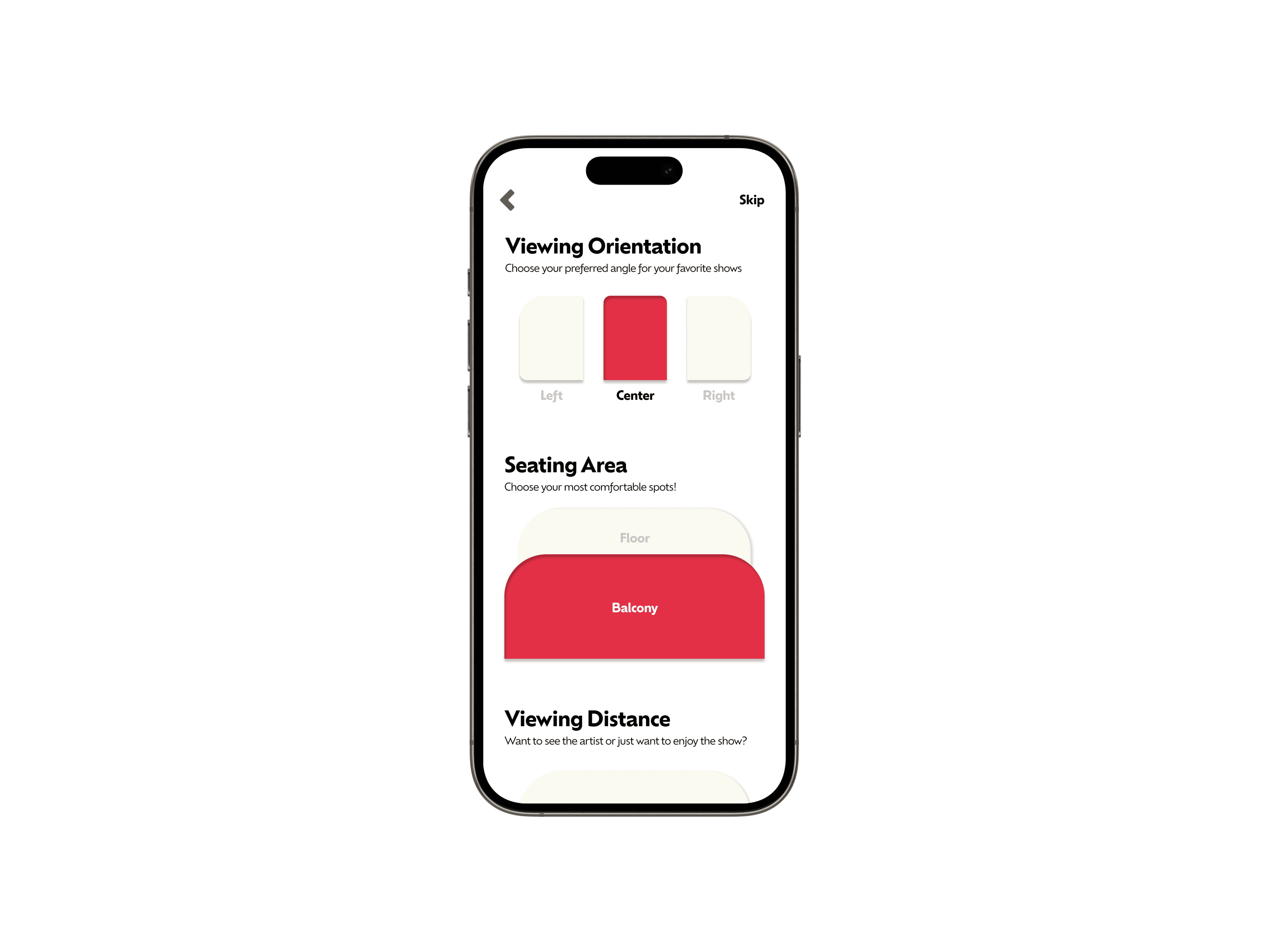
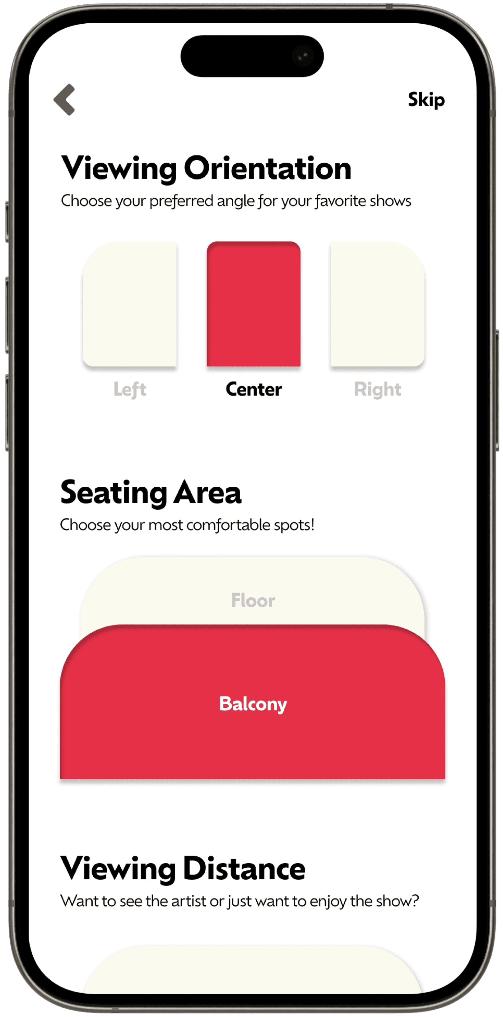
User Flow
User Flow
Task 1
Register or sign in
Choose your show & seat preferences
Access the personalized home screen
Register or sign in
Choose your show & seat preferences
Access the personalized home screen
Task 2
Begin on the home screen
Locate a show that interests you
Select seats, and proceed to the cart
Task 3
Begin at cart
Proceed to the checkout page
Transfer your tickets to a recipient
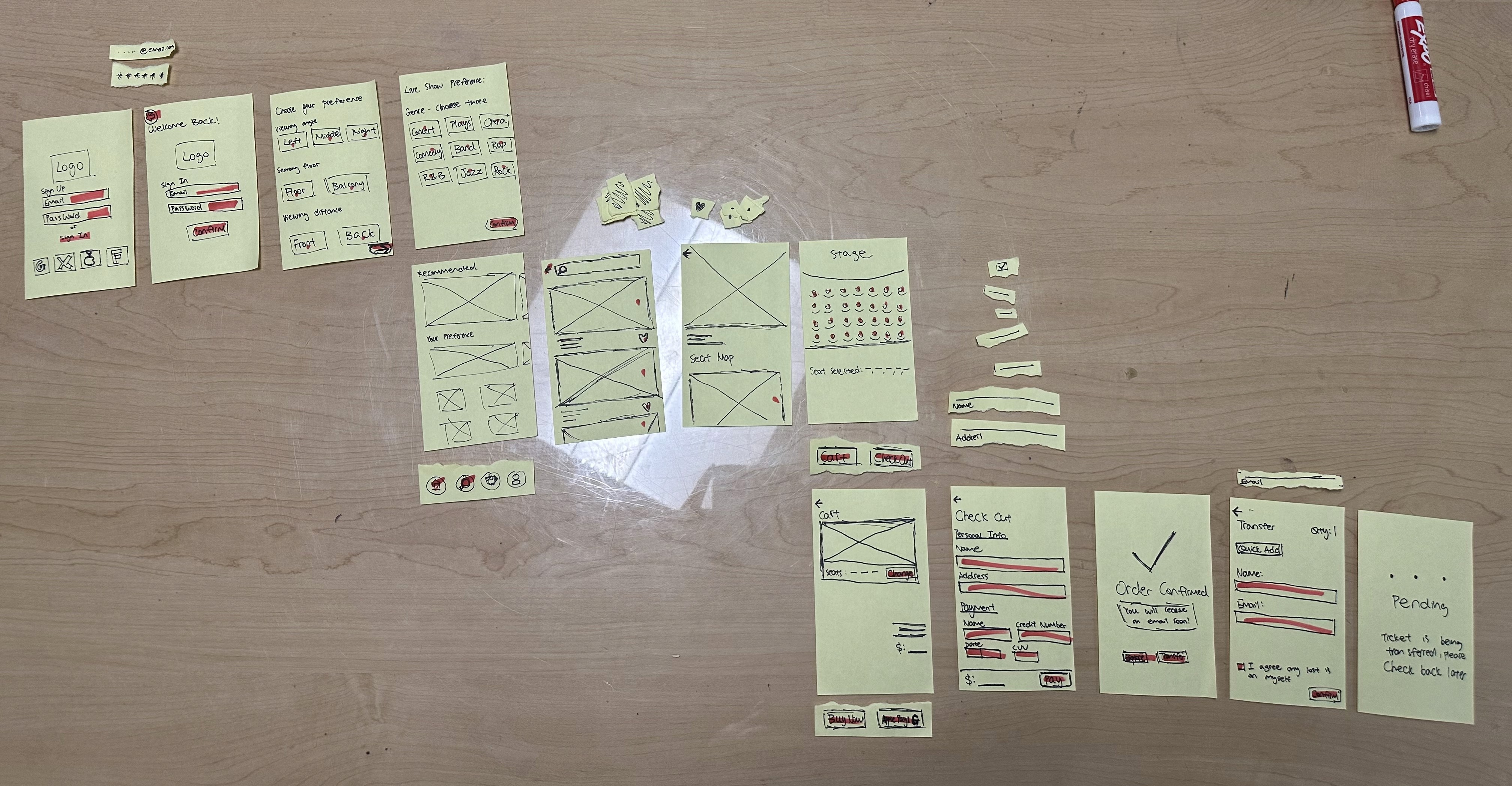
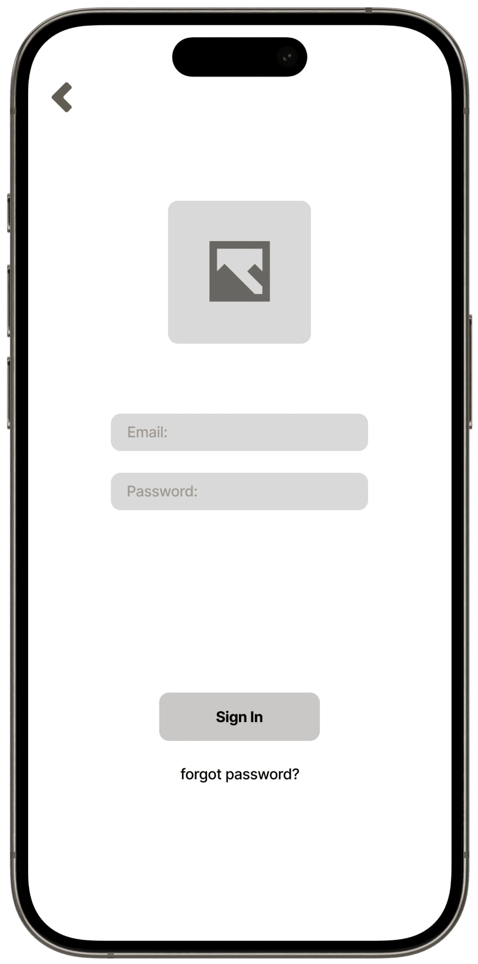
Img 5. User task flows on paper prototype
Img 5. User task flows on paper prototype
To test if the task flows are in a logical order, I invited three participants to test out the paper prototype and stimulate the mobile application experience in real life.
To test if the task flows are in a logical order, I invited three participants to test out the paper prototype and stimulate the mobile application experience in real life.
"To test if the task flows are in a logical order, I invited three participants to test out the paper prototype and stimulate the mobile application experience in real life."

Participant 1
Participant 1
Postive
Postive
Feedback:
Feedback:
The task flows are structured similarly to other applications with the same purpose.
The task flows are structured similarly to other applications with the same purpose.
This familiar order was helpful to complete the tasks without much difficulty.
This familiar order was helpful to complete the tasks without much difficulty.
Participant 2
Participant 2
Neutral
Neutral
Feedback:
Feedback:
The participant noted that the overall flow logic did not present any critical issues.
The participant noted that the overall flow logic did not present any critical issues.
However, it was difficult trying to transfer the ticket after purchasing.
However, it was difficult trying to transfer the ticket after purchasing.

Participant 3
Participant 3
Negative
Negative
Feedback:
Feedback:
The participant identified a major issue with the cart feature.
The participant identified a major issue with the cart feature.
It was noted that carting wasn’t necessary to access the checkout screen.
It was noted that carting wasn’t necessary to access the checkout screen.
Final Task Flow
Login/Sign Up
Login/Sign Up
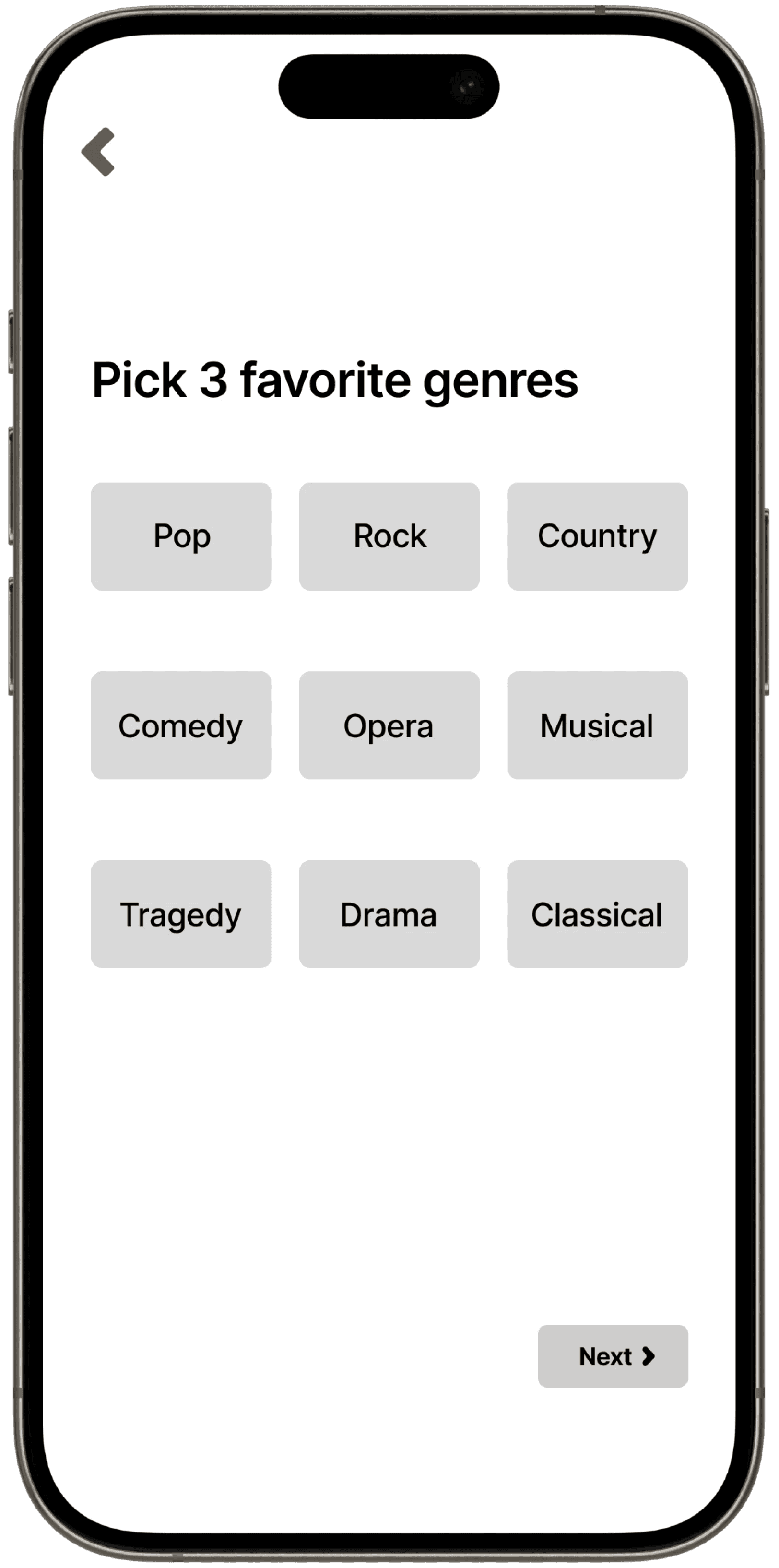
Show preference
Show preference
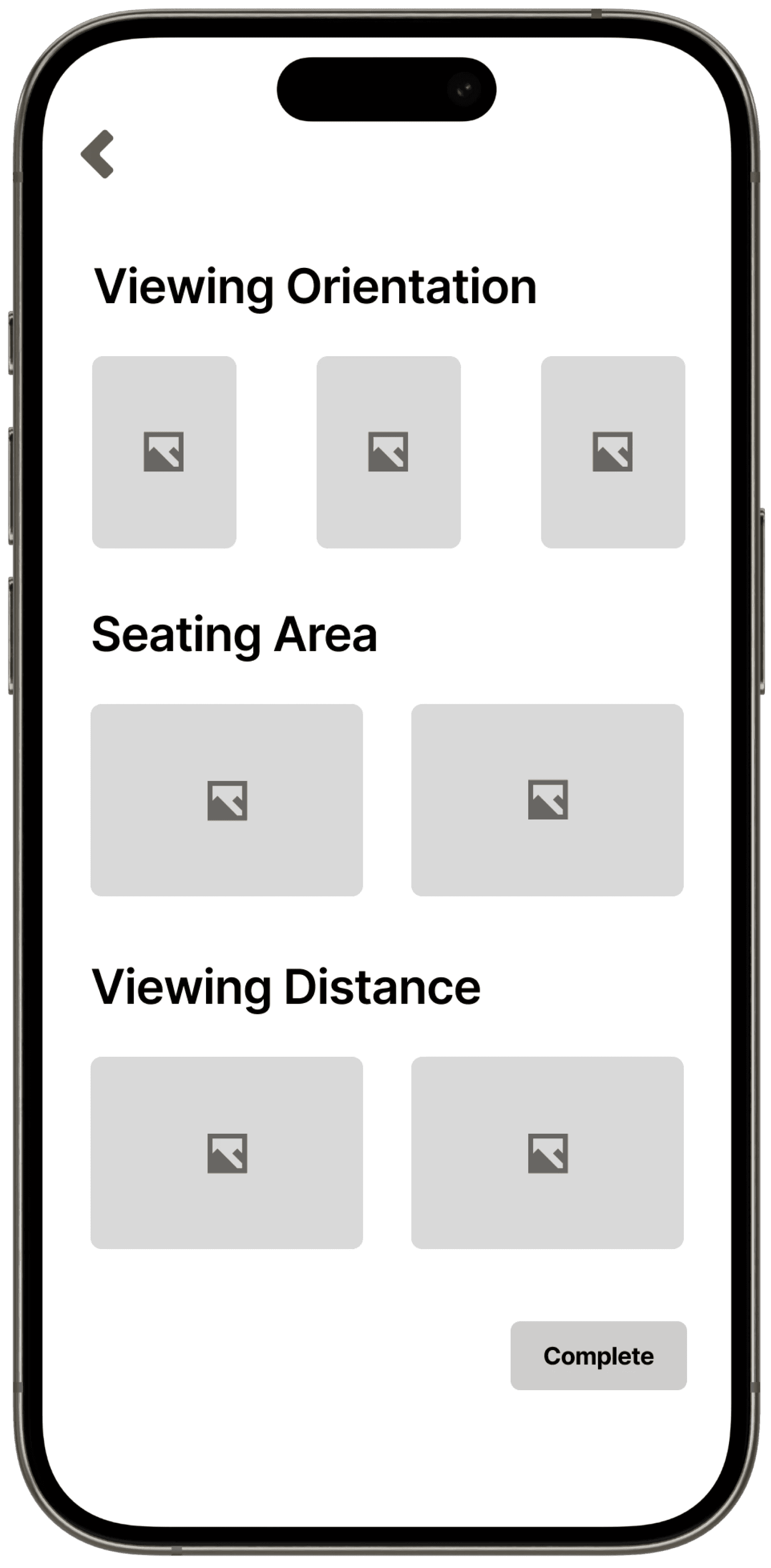
Seating Preference
Seating Preference
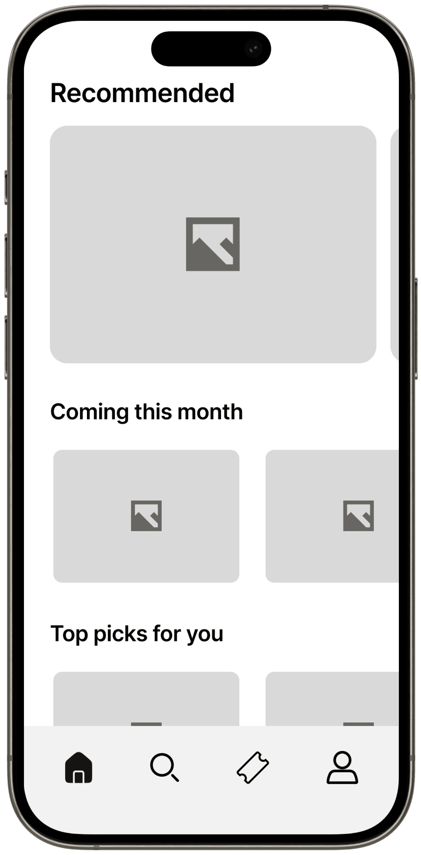
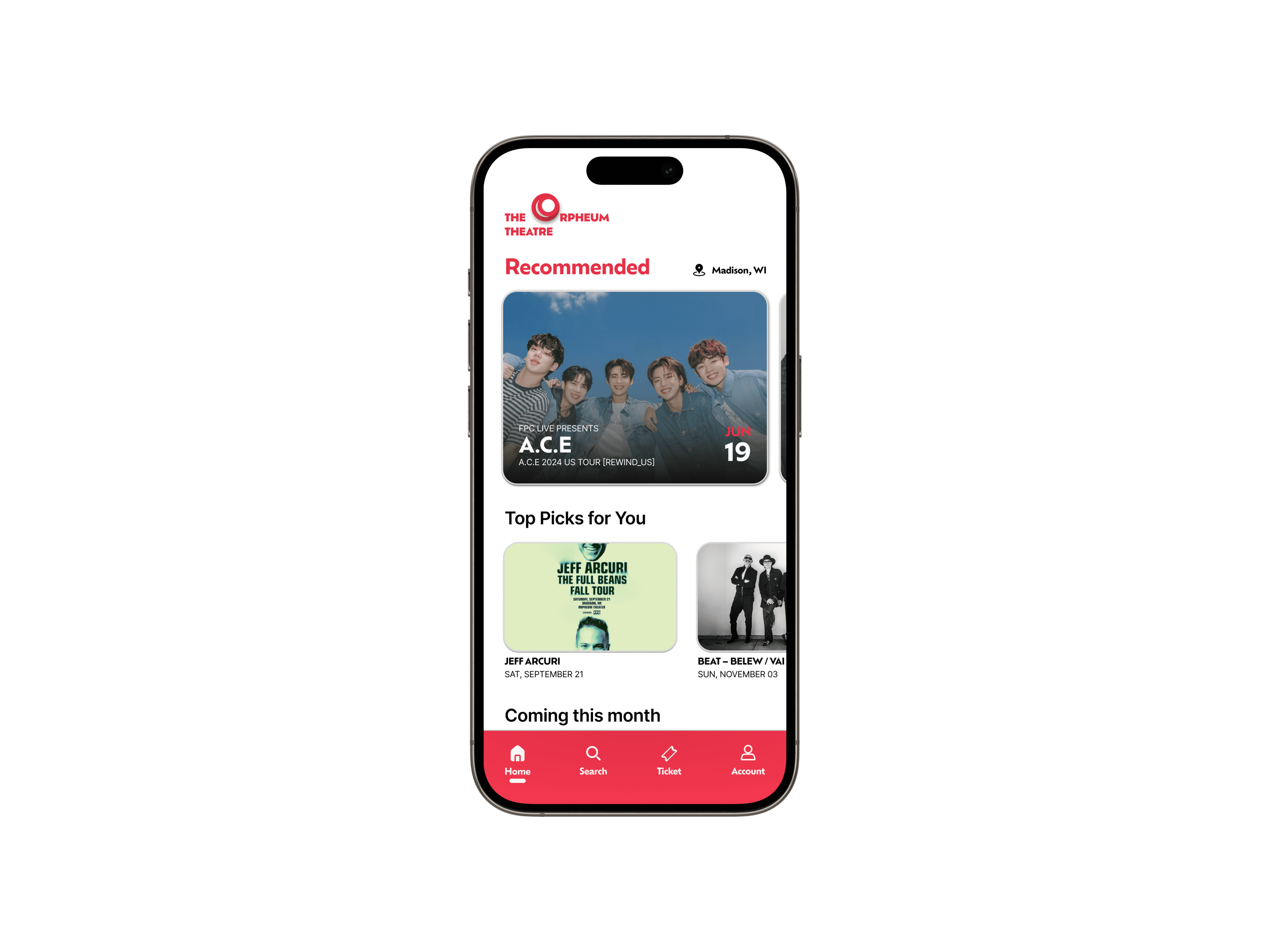
Homepage
Homepage
Homepage
Homepage
Product page
Product page
Seating popup
Seating popup
Shopping cart
Shopping cart
Shopping cart
Shopping cart
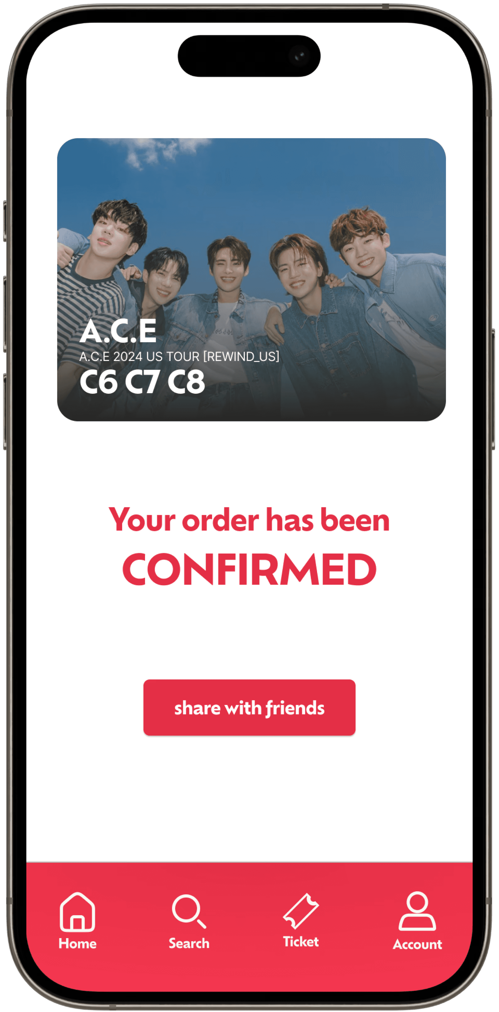
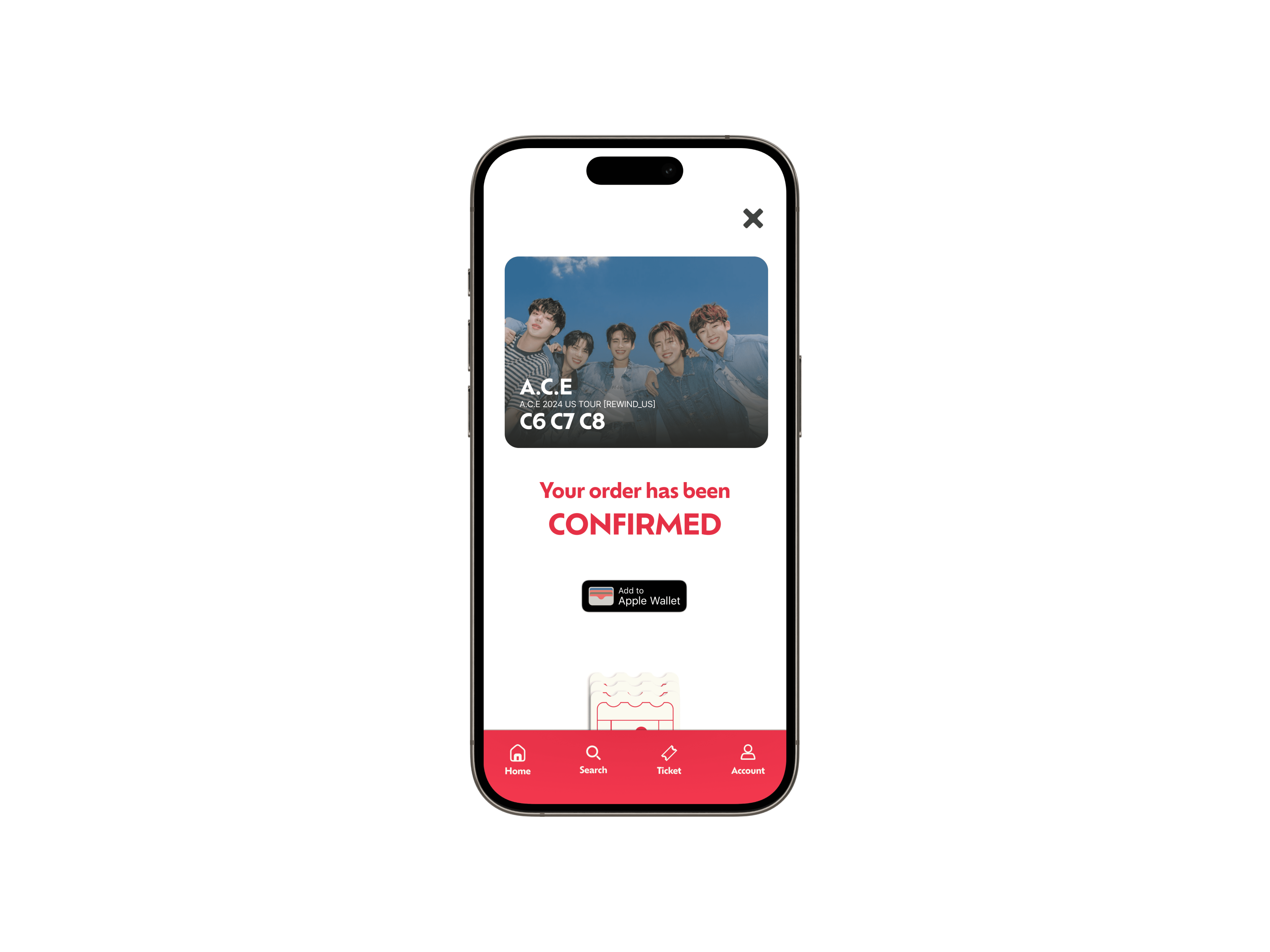
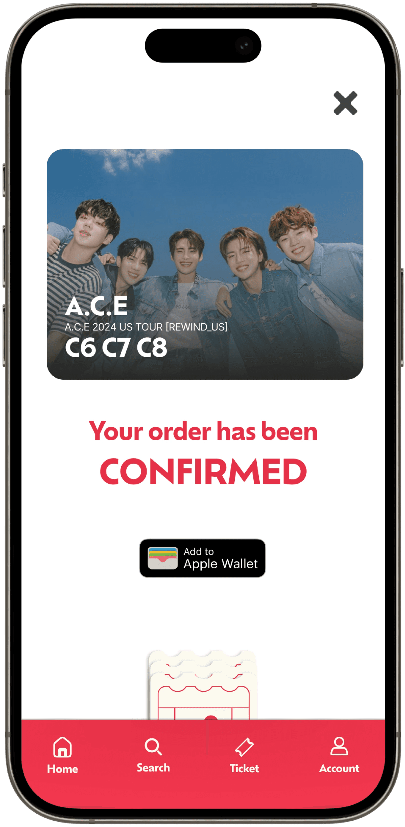
Checkout page
Checkout page
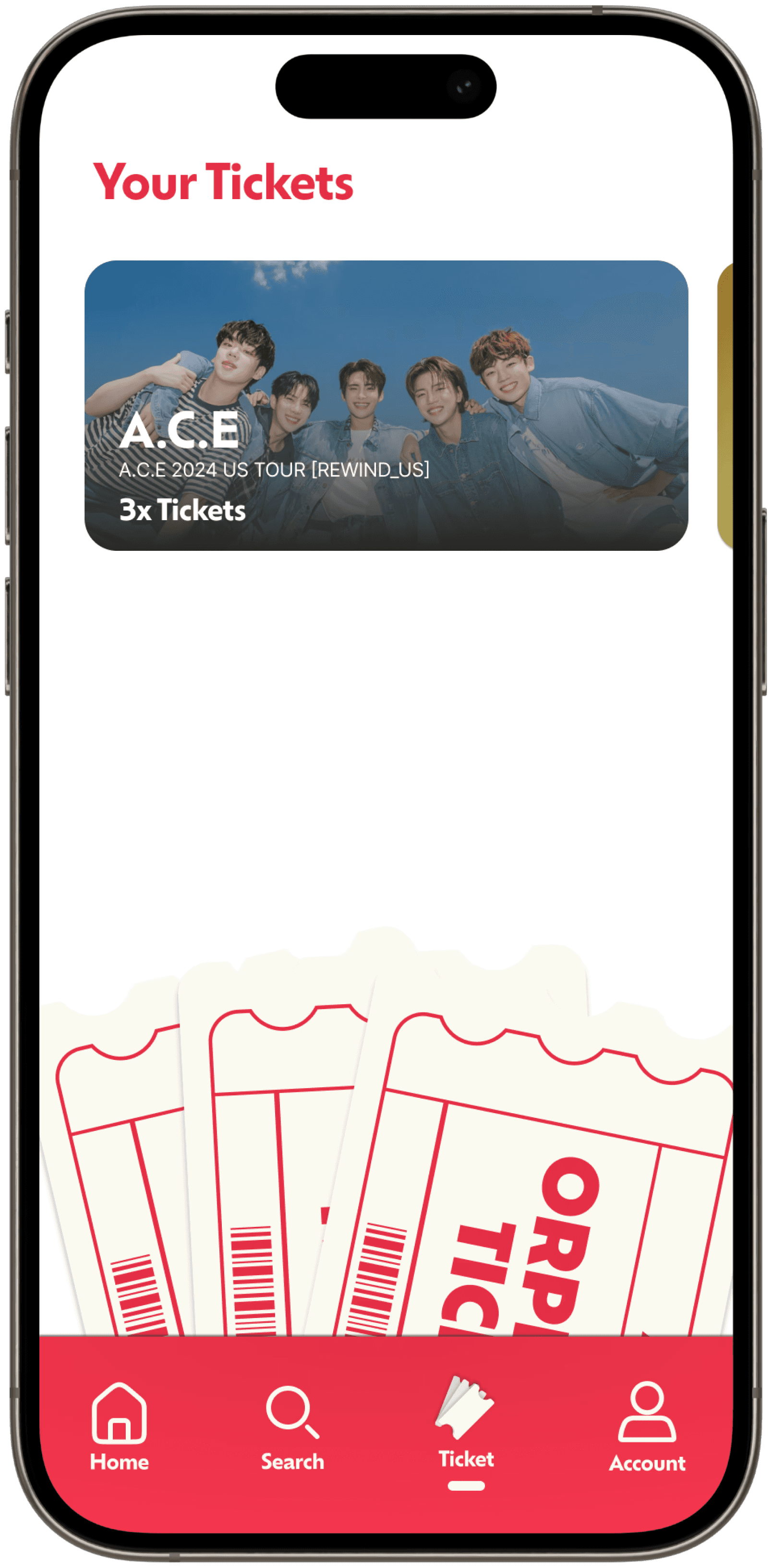
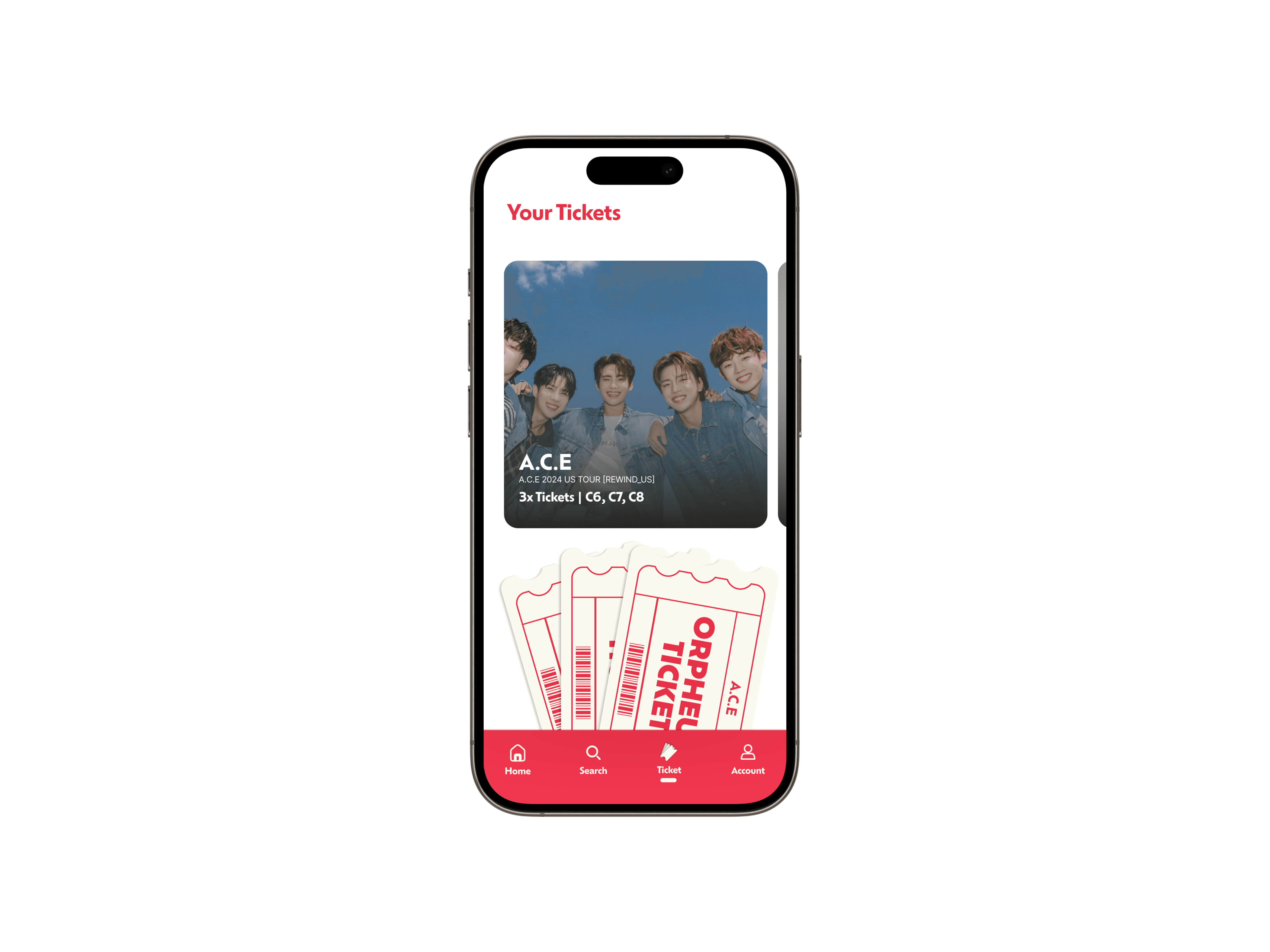
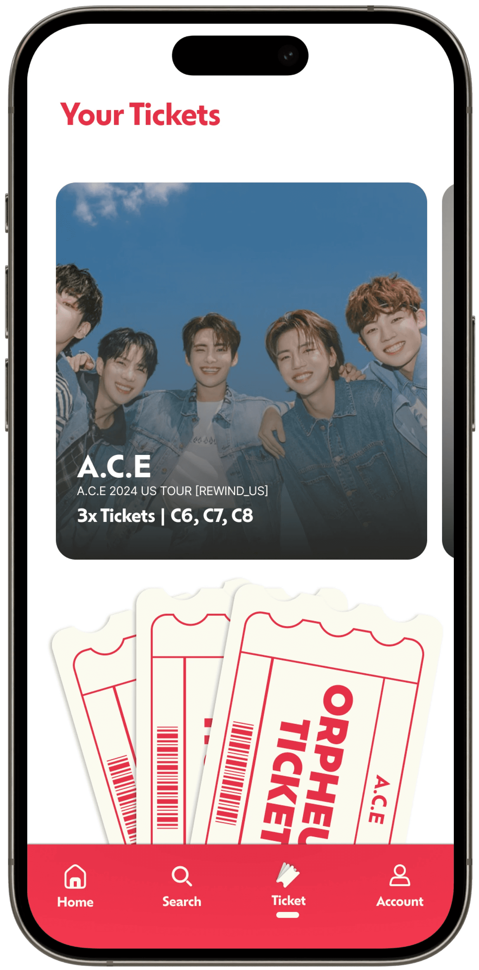
Ticket page
Ticket page
Ticket transfer page
Transfer page
Design System
Design System
Color Palette
Color Palette
Brand Red (#E43046)
Main color
Brand Red
(#E43046)
Mai
Cream (#FBFAF0)
Secondary color
Cream
(#FBFAF0)
Secondary
Dark (#111111)
Text Color
Dark
(#111111)
Text
White (#FFFFFF)
Background color
White
(#FFFFFF)
Background
Font style
Font style
Header 1
Ofelia Display/
Bold 30pt
Header 1
Ofelia Display/
Bold 30pt
Header 2
Ofelia Display/
Medium 18pt
Header 2
Ofelia Display/
Medium 18pt
Header 3
Ofelia Display/
Medium 15pt
Header 3
Ofelia Display/
Medium 15pt
Button
Ofelia Display/
Regular 13pt
Button
Ofelia Display/
Regular 13pt
Body
Inter/
Regular 12pt
Body
Inter/
Regular 12pt
Description
Inter/
Light 11pt
Description
Inter/
Light 11pt
Goal
Establish a design system to ensure visual consistency and create a strong foundation for moving smoothly into the prototyping phase.
Goal
Establish a design system to ensure visual consistency and create a strong foundation for moving smoothly into the prototyping phase.
Result
The defined design system established a clear guideline for typography, color palette, effects, and layout for the next stages.
Result
The defined design system established a clear guideline for typography, color palette, effects, and layout for the next stages.
Design
04 | Design phase
Designing the prototype in Low, Medium, and High fidelity in Figma
Low-Fidelity
Low-Fidelity
Revision Focus
Revision Focus
Revision Focus
Identify design issues, annotate improvements, and propose additions.
Identify design issues, annotate improvements, and propose additions.
Identify design issues, annotate improvements, and propose additions.
Review new features, test overall flow, and resolve overlooked details.
Review new features, test overall flow, and resolve overlooked details.
Review new features, test overall flow, and resolve overlooked details.
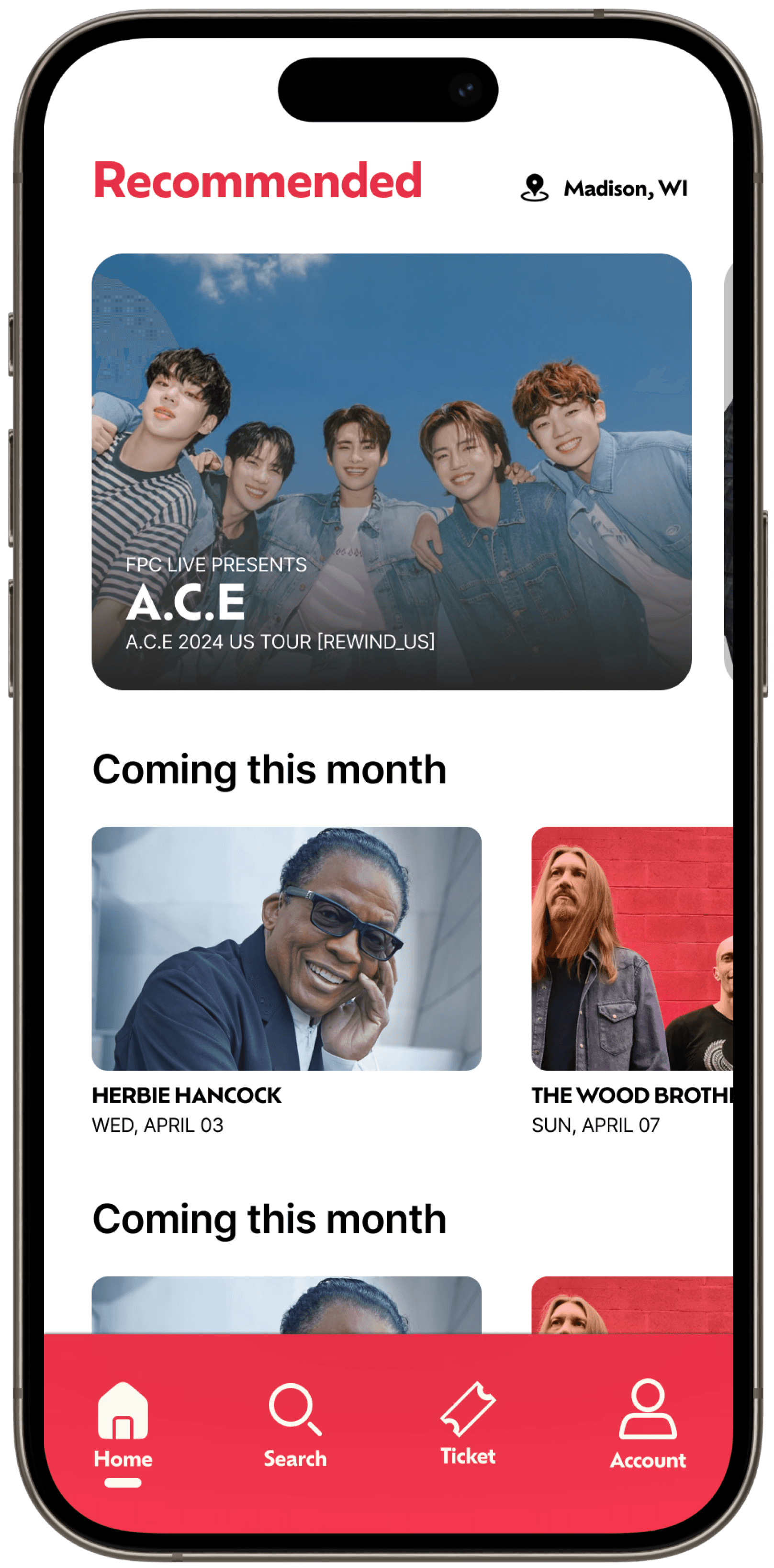
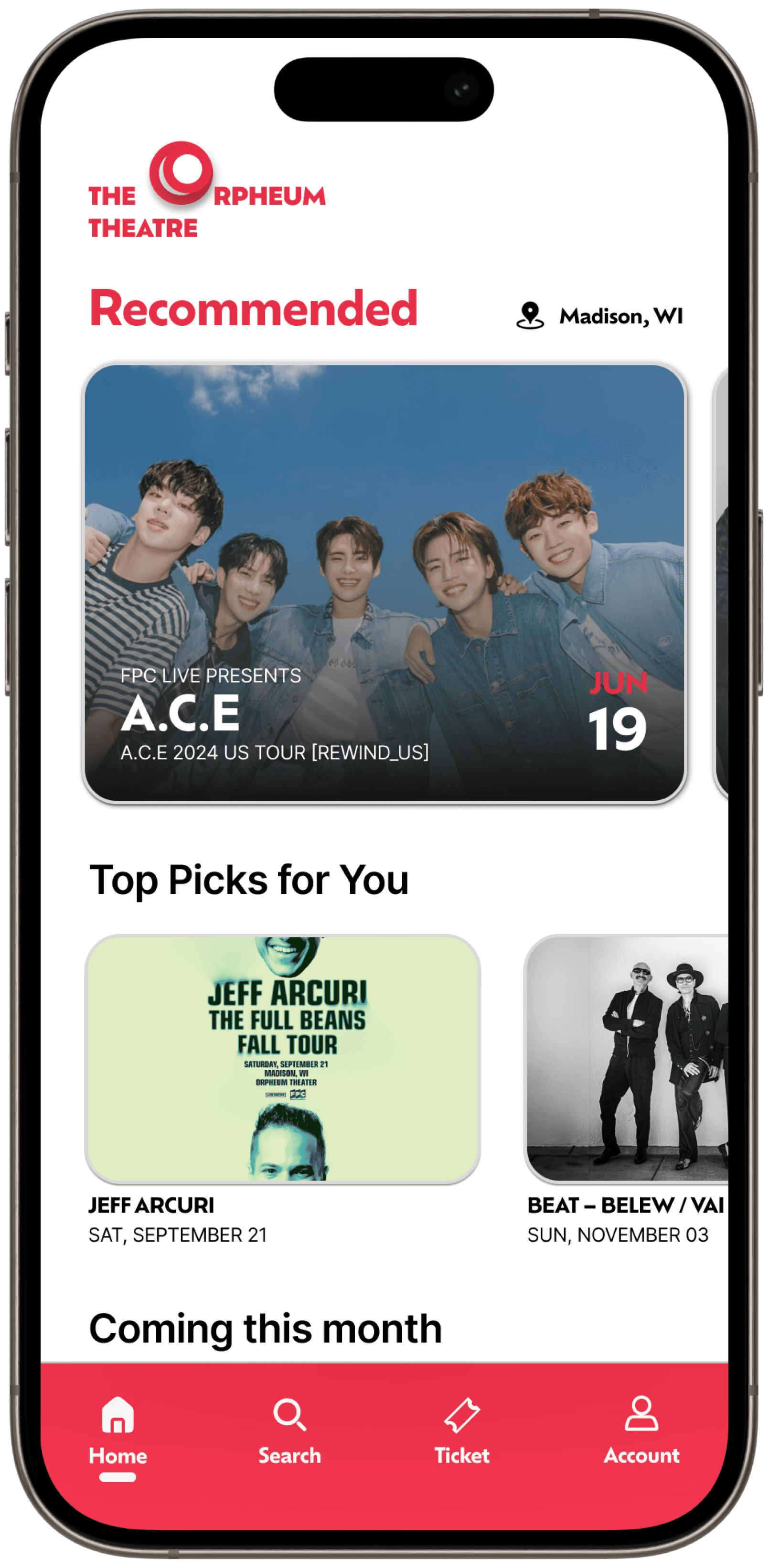
Img 6. Low Fidelity Prototype of the Orpheum Theater
Img 6. Low Fidelity Prototype of the Orpheum Theater
Medium-Fidelity
Medium-Fidelity
Revision Focus
Revision Focus
Revision Focus
Finalize visuals and design system.
Finalize visuals and design system.
Finalize visuals and design system.
Complete and organize task flow screens.
Complete and organize task flow screens.
Complete and organize task flow screens.
Create reusable static components to maintain consistency across all screens.
Create reusable static components to maintain consistency across all screens.
Create reusable static components to maintain consistency across all screens.
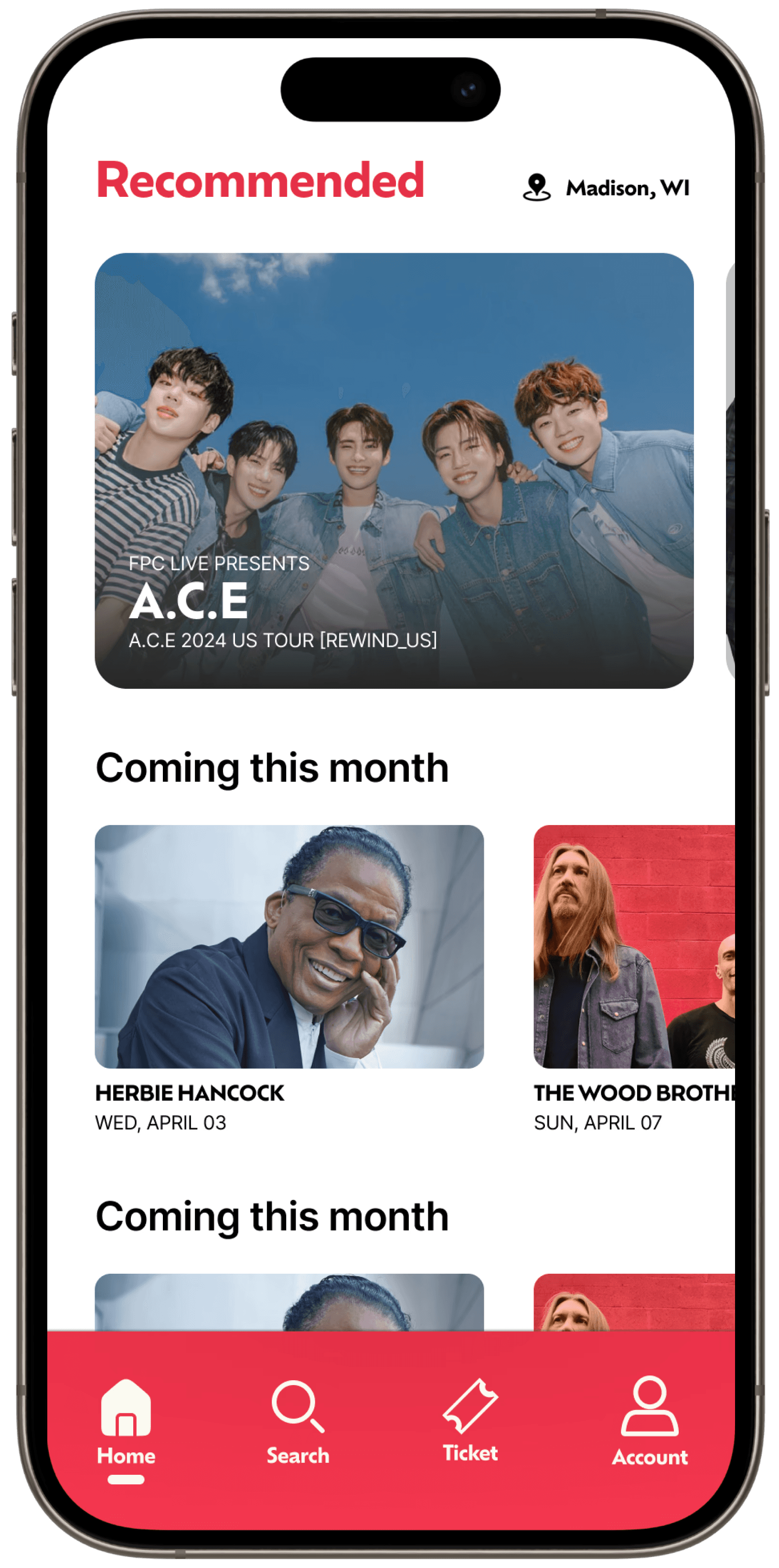

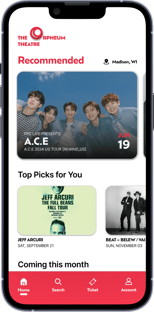
Img 7. Medium Fidelity Prototype of the Orpheum Theater
Img 7. Medium Fidelity Prototype of the Orpheum Theater
High-Fidelity
High-Fidelity
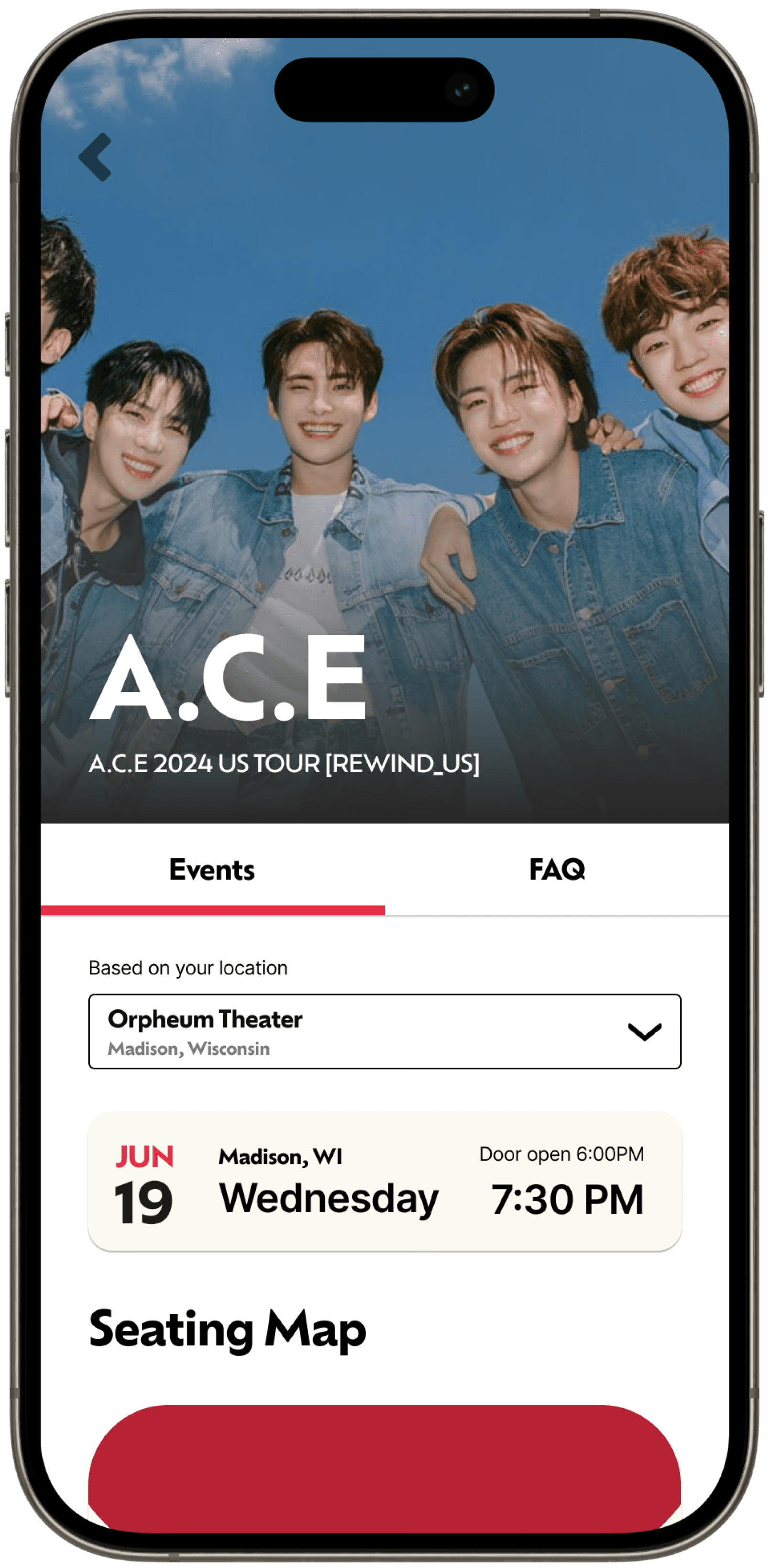
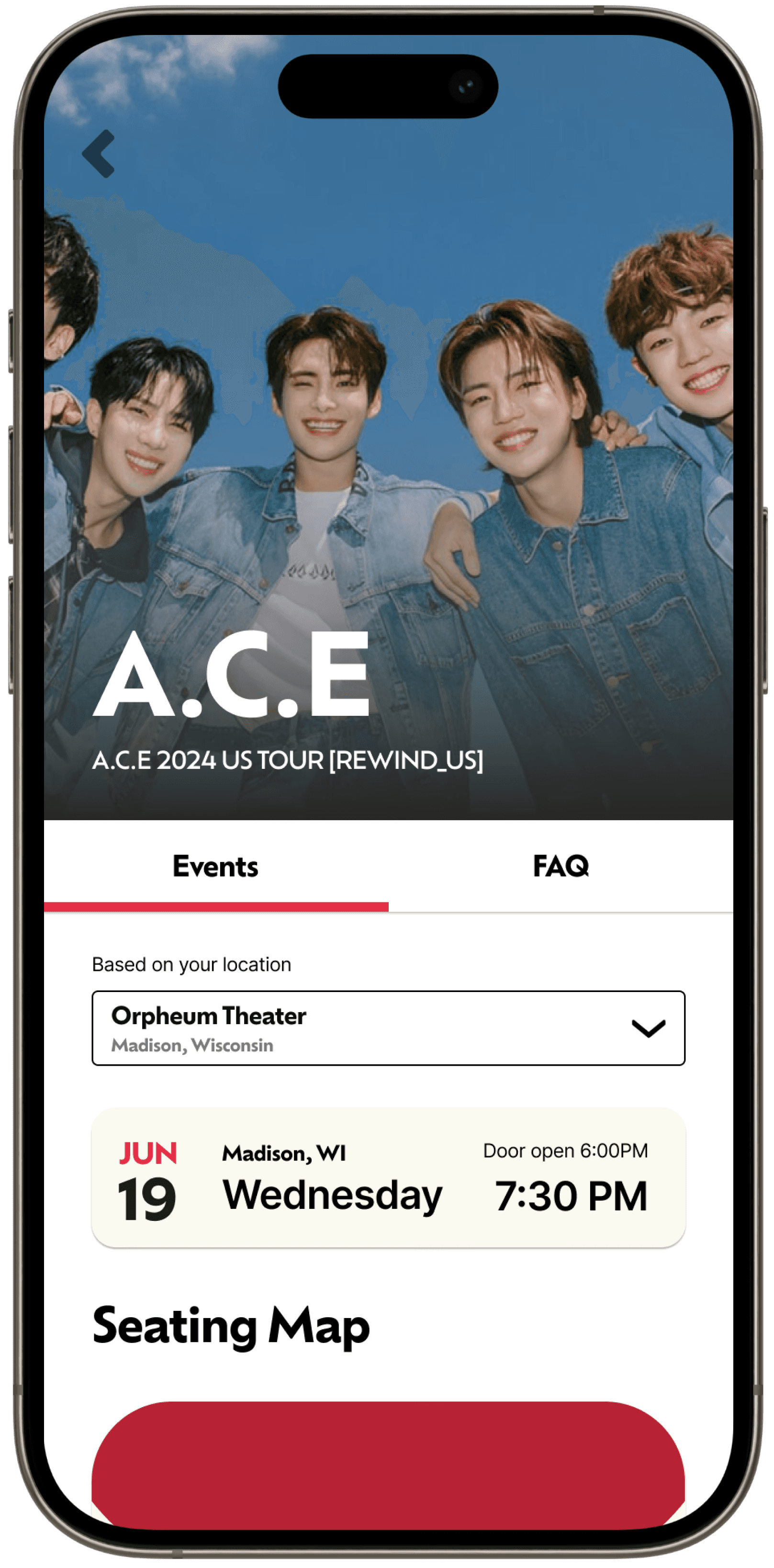
Img 8. High Fidelity Prototype of the Orpheum Theatre mobile app via Figma
Img 8. High Fidelity Prototype of the Orpheum Theatre mobile app via Figma
Debug
Debug
New feature testing
New feature testing
Old feature testing
Old feature testing
Adjust components
Adjust components
Delight
Delight
Animate components
Animate components
Animate icon
Animate icon
Animate screens
Animate screens
Organize
Organize
Link all screens
Link all screens
Connect user flows
Connect user flows
Delete old frames
Delete old frames
Reflection
05 | Reflection 🪞
Lesson, Joys, and Pains
Biggest takeaway from this project, and how I can improve on future projects
Lessons
Lessons
Preparation do wonders
Preparation do wonders
Establishing deadlines for every significant milestone was one of the most valuable lessons that came out of this project, which ensured the project moved forward smoothly even when stuck.
Establishing deadlines for every significant milestone was one of the most valuable lessons that came out of this project, which ensured the project moved forward smoothly even when stuck.
The power of feedback
The power of feedback
Listening to others helped the prototype reflect my original vision. Constructive feedback shaped the outcome to match what I had envisioned in the planning phase.
Listening to others helped the prototype reflect my original vision. Constructive feedback shaped the outcome to match what I had envisioned in the planning phase.
Joys
Joys
Surpassing expectations
Surpassing expectations
The project exceeded my expectations, with animations and the reflection on the original ideas aligning closely with how I imagined in earlier phases.
The project exceeded my expectations, with animations and the reflection on the original ideas aligning closely with how I imagined in earlier phases.
Design consistency
Design consistency
The use of design systems and grids was instrumental in maintaining consistency across the entire application mockup.
The use of design systems and grids was instrumental in maintaining consistency across the entire application mockup.
Pains
Pains
Insufficient research
Insufficient research
A lack of thorough research on similar products before starting the project significantly slowed down my work rate.
A lack of thorough research on similar products before starting the project significantly slowed down my work rate.
Time-Consuming
Time-Consuming
The main reason why the project took longer than expected on certain steps was due to my refusal to use templates online, which could have saved me so much time.
The main reason why the project took longer than expected on certain steps was due to my refusal to use templates online, which could have saved me so much time.